Overview
This guide explains how to build a full CRF in the Form Builder editor, from structure design to rule setup and version save.
Editor URL pattern:
https://[instance]/apps/formbuilder/crf-version/[versionId]
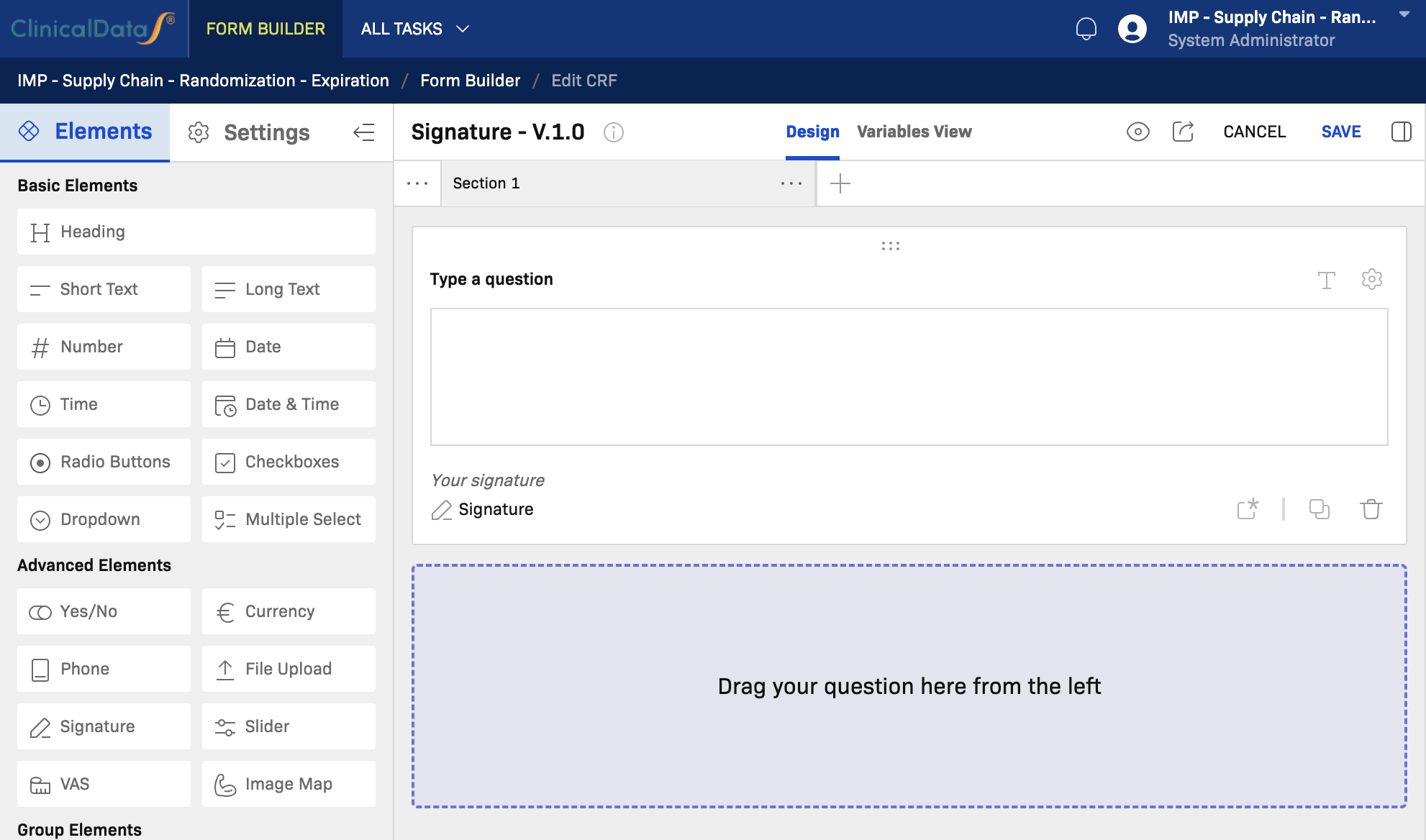
CRF Editor Interface
The editor has three main areas:
- Left panel — Elements palette and CRF-level Settings switcher
- Center canvas — Section containers and questionnaire layout
- Right panel — Field Information, Rules, and Errors tabs
Top toolbar actions: Preview, CANCEL, and SAVE.
Two Views and Purposes
The CRF editor provides two layouts, each with a different purpose:
| View | Purpose | Typical users |
|---|---|---|
| Design | Build and maintain the CRF structure: sections, components, field settings, and rules. | Study designers, data managers, form builders |
| Variables View | Show a table of all variables (columns) defined in this CRF for review, mapping, and downstream data/export checks. | Data managers, programmers, integration/reporting teams |
Design View
Use Design when you need to create or update the form itself:
- Add sections and questions
- Configure component settings
- Define display, validation, and calculation rules
- Preview and save the CRF version
Variables View
Use Variables View when you need a structured variable inventory:
- Review all variable columns in one table
- Check variable names/codes for consistency
- Prepare mapping for exports, integrations, and analysis datasets
- Perform final variable QA before locking a version
Component Settings (Common)
Every component in the canvas has a settings icon (gear icon) on its right side. Clicking it opens a settings modal with the following fields:
| Setting | Description |
|---|---|
| Field label | The visible label shown to site users when filling in the form. |
| Code | A unique machine-readable identifier for the field used in data export, mapping, and rules. Follow a consistent naming convention across CRFs. |
| Description | An optional internal note or annotation about this field. Descriptions are useful for data managers and auditors. |
| Required | When enabled, the field must be filled before the form can be submitted. Use only for protocol-mandated fields to avoid unnecessary submission blockers. |
| Read-only | When enabled, the field value cannot be edited by site users. Useful for auto-populated or calculated fields. |
| PHI data | Marks the field as containing Protected Health Information. PHI-flagged fields are subject to additional access controls and audit requirements. |
| Help text | Supplementary instruction text shown alongside the field to guide data entry. |
| Help text display | Controls how and when the help text is shown — for example, always visible or revealed on demand (tooltip/icon). |
| Hidden | When enabled, the field is hidden from site users by default. Typically used with Display rules to conditionally reveal the field. |
Note: Depending on the component type, additional component-specific settings may also appear in this modal (for example, min/max values for Number, options list for Radio Buttons).
Component Reference
Basic Elements
Heading
When to use: Use Heading to add a visual section title or label within the canvas. Headings are non-data-capture elements used to organize content for readability.
Key notes:
- Does not capture data; no field code is required.
- Use sparingly to avoid cluttering the section layout.
- Supports basic formatting for the heading text.
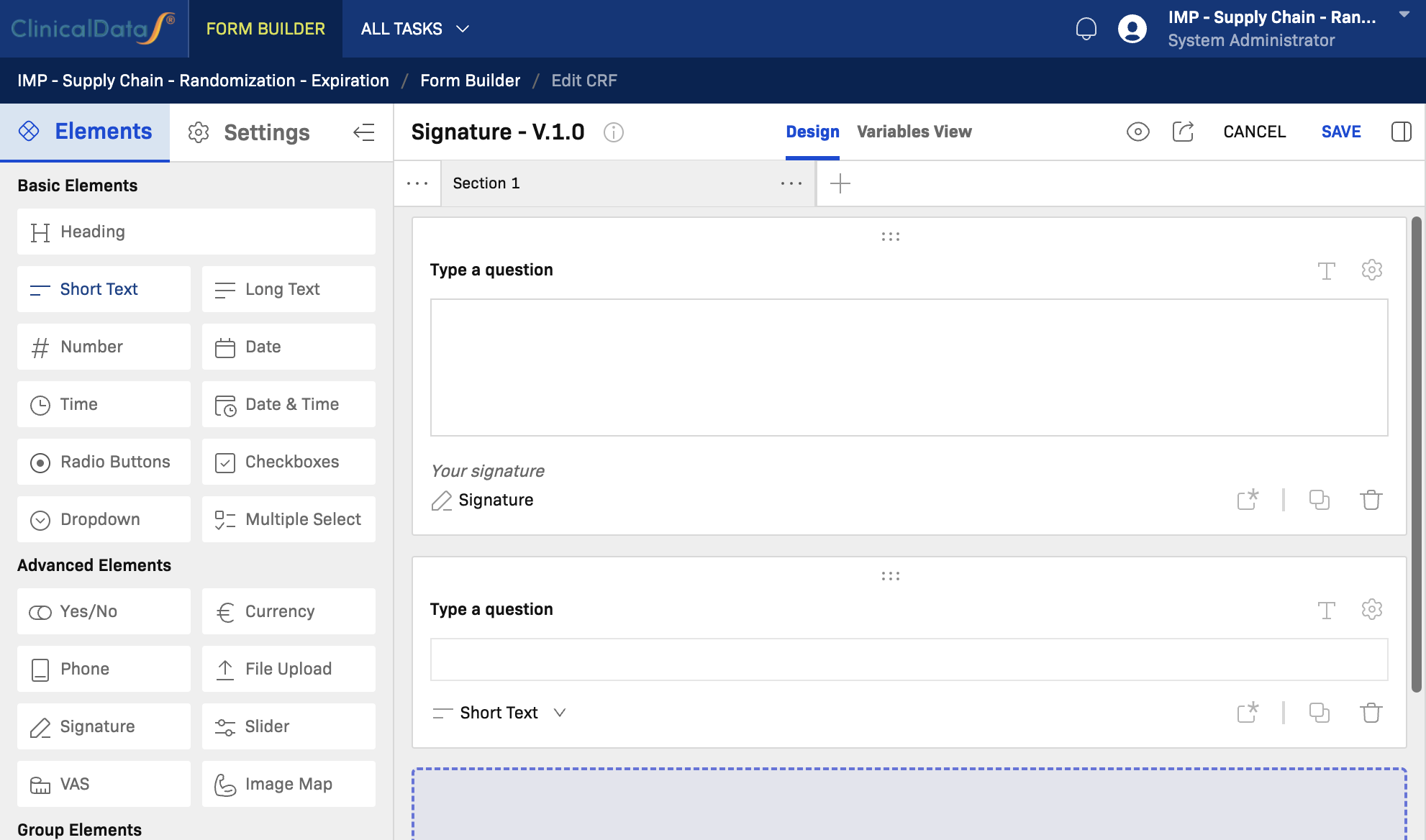
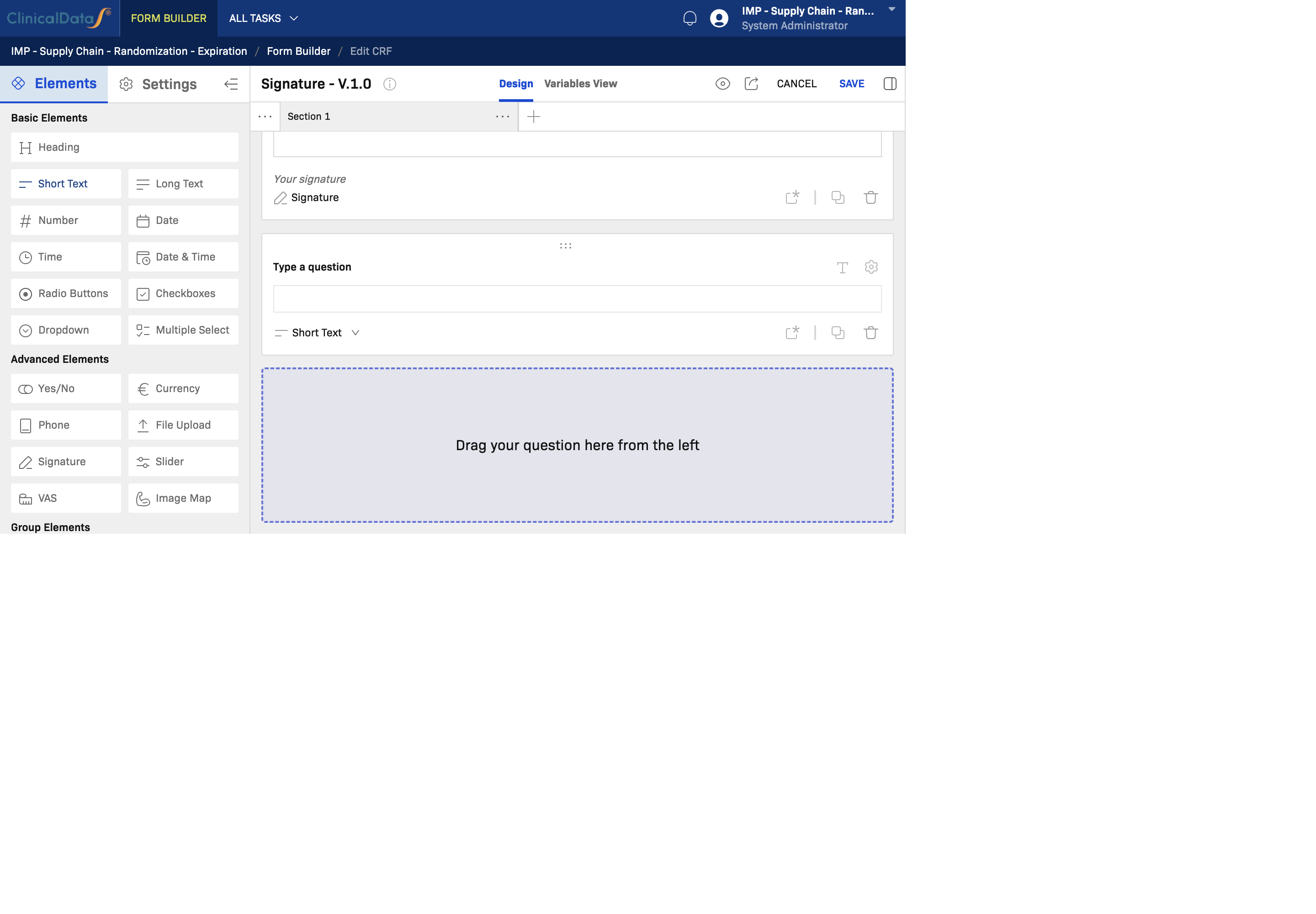
Short Text
When to use: Use Short Text for free-entry single-line responses, such as subject initials, IDs, names, medical terms, or short notes.
Key notes:
- Suitable for identifiers, names, and short free-text values.
- Can have a character limit configured in field settings.
- Apply validation rules for format enforcement (e.g., alphanumeric patterns).
- Not suitable for multi-line narrative; use Long Text instead.
Long Text
When to use: Use Long Text for multi-line free-text responses, such as adverse event descriptions, medical histories, or comments.
Key notes:
- Suitable for narrative, notes, and detailed descriptions.
- Can be configured as Read-only for reference text or auto-populated values.
- Consider using with a Display rule to show only when relevant (e.g., show AE description when AE = Yes).
Number
When to use: Use Number for numeric data entry such as age, weight, height, dosage, laboratory values, or scores.
Key notes:
- Configure minimum and maximum allowed values in settings to enforce clinical ranges.
- Supports decimal precision settings.
- Use with Calculation rules to derive values (e.g., BMI from height and weight).
- Combine with Validation rules to warn or block out-of-range entries.
Date
When to use: Use Date for calendar date fields such as date of birth, visit date, start date, or end date.
Key notes:
- Renders a date picker in the form.
- Supports partial date entry (year only, year-month) depending on configuration.
- Use with Validation rules to enforce date ranges or relative date constraints (e.g., visit date must not be in the future).
Time
When to use: Use Time for time-of-day values such as procedure start time, medication administration time, or observation time.
Key notes:
- Renders a time picker (HH:MM format).
- Use alongside a Date field when a full datetime value is needed at the source level.
- For combined date and time in a single field, use Date & Time instead.
Date & Time
When to use: Use Date & Time when both the date and time of an event must be captured in a single field, such as adverse event onset or sample collection timestamp.
Key notes:
- Combines date picker and time picker in one component.
- Preferable over separate Date + Time fields when the values are always recorded together.
- Apply validation rules for date-time range constraints.
Radio Buttons
When to use: Use Radio Buttons for single-choice selection from a predefined list, such as sex, yes/no, response categories, or severity grades.
Key notes:
- Only one option can be selected at a time.
- Options are defined in Field Information (options list).
- Use for short lists (2–7 options); switch to Dropdown for longer lists.
- Supports coded values for each option for data export mapping.
Checkboxes
When to use: Use Checkboxes when participants can select multiple applicable options, such as symptoms, comorbidities, or concurrent medications.
Key notes:
- Multiple selections are allowed.
- Avoid Checkboxes when only one selection is valid; use Radio Buttons instead.
- Each checked option generates a separate data value.
Dropdown
When to use: Use Dropdown for single-choice selection from a longer list, such as country, region, medication name, or diagnosis code.
Key notes:
- Best for lists with 8 or more options.
- Keeps the canvas compact compared to Radio Buttons.
- Supports coded values for each option.
- Consider adding a "Not specified" or "Other" option with an associated text field.
Multiple Select
When to use: Use Multiple Select for multi-choice selection from a list when a compact presentation is preferred over Checkboxes.
Key notes:
- Allows selecting multiple values from a dropdown-style list.
- Use when you have a medium-to-long option list with multiple selections allowed.
- Functionally similar to Checkboxes but in a more compact format.
Advanced Elements
Yes/No
When to use: Use Yes/No for simple binary questions, such as "Did the subject experience an adverse event?" or "Is the subject currently using medication?"
Key notes:
- Renders a two-option (Yes/No) control; a specialized shortcut for Radio Buttons with two fixed options.
- Commonly used as a trigger for Display rules — for example, revealing a detail section when answer is Yes.
- Field code and coded values follow the standard radio pattern.
Currency
When to use: Use Currency for monetary values with currency formatting, such as reimbursement amounts or cost tracking.
Key notes:
- Renders a numeric input with currency symbol and formatting.
- Configure the currency type in field settings.
- Use where financial data is part of the protocol.
Phone
When to use: Use Phone for telephone number entry, such as emergency contacts or site contact numbers.
Key notes:
- Provides phone number formatting and validation.
- Supports international format configuration.
File Upload
When to use: Use File Upload when participants or site staff need to attach supporting documents such as lab reports, consent forms, or images.
Key notes:
- Supported file types and maximum file size may be configured.
- Uploaded files are associated with the specific subject and visit record.
- PHI considerations apply — mark as PHI if the uploaded files contain identifiable information.
Signature
When to use: Use Signature to capture an electronic signature from the subject or authorized site staff, such as for consent confirmation or investigator sign-off.
Key notes:
- Renders a digital signature pad in the form.
- Signature image is stored with the record.
- Typically placed at the end of a section or CRF as a sign-off step.
- Subject to e-signature regulatory compliance requirements (e.g., 21 CFR Part 11).
Slider
When to use: Use Slider for ordered scale responses where the participant selects a value by sliding a control, such as pain intensity (0–10) or satisfaction scores.
Key notes:
- Configure the minimum, maximum, and step increment.
- Visually intuitive for subjective scale ratings.
- Use alongside a Number field if a precise numerical value must also be recorded.
VAS (Visual Analogue Scale)
When to use: Use VAS (Visual Analogue Scale) for continuous scale assessment, most commonly for pain or symptom intensity on a 0–100 scale without discrete steps.
Key notes:
- Renders a continuous analog slider, unlike the stepped Slider component.
- Standard in clinical trials measuring pain: 0 = no pain, 100 = worst imaginable pain.
- The resulting value is a continuous number; apply appropriate range validation.
Image Map
When to use: Use Image Map when a participant or clinician must indicate a location on a graphical image, such as marking a body region for symptoms or pain location.
Key notes:
- A custom image is uploaded and regions are defined as selectable zones.
- Useful for anatomy-based symptom localization.
- Requires image and hotspot configuration in field settings.
Group Elements
Group
When to use: Use Group to bundle related fields together within a section. A group allows repeated instances of the same set of fields (for example, multiple medication entries).
Key notes:
- Fields inside a group share the same repeat context.
- Groups can be configured as repeatable (add-row pattern).
- Use when you need to capture multiple instances of a related data set within one section.
Table
When to use: Use Table to present and capture structured data in a row-and-column grid format, such as laboratory panels, concomitant medications, or multi-visit assessment grids.
Key notes:
- Columns are defined as field types; rows can be added dynamically.
- Useful for structured lists where each row represents a separate data record.
- More compact than stacked Groups when columns are consistent across rows.
Matrix
When to use: Use Matrix for grid-style questionnaires where the same set of options is rated across multiple items — for example, quality-of-life questionnaires or symptom severity grids.
Key notes:
- Rows represent items/questions; columns represent response options.
- Efficient for surveys with repeated response scales across many items.
- All cells in the matrix share the same option set.
Embedding
When to use: Use Embedding to embed an external resource or content (such as an external form, calculator, or HTML widget) directly within the CRF canvas.
Key notes:
- Used for advanced integrations or specialized embedded views.
- Requires a valid embed source URL or configuration.
- Use with caution — ensure embedded content meets security and data privacy requirements.
Clinical Elements
Blood Pressure
When to use: Use Blood Pressure to capture systolic and diastolic blood pressure readings in a single standardized component.
Key notes:
- Renders two numeric inputs (Systolic / Diastolic) in one component.
- Preferable to two separate Number fields as it enforces the paired structure.
- Apply validation rules for clinically acceptable ranges (e.g., SBP 60–250, DBP 40–150).
- Units (mmHg) are typically preconfigured.
BMI
When to use: Use BMI when body mass index needs to be captured or calculated from height and weight inputs.
Key notes:
- May auto-calculate BMI from linked Height and Weight fields using a Calculation rule.
- Can be set to Read-only when the value is derived rather than directly entered.
- Useful in demographics and vital signs sections.
Vital Sign
When to use: Use Vital Sign to capture a standardized set of vital sign measurements in a structured format, such as temperature, pulse, respiration rate, and blood pressure.
Key notes:
- Bundles multiple clinical measurements in a single component.
- Reduces setup effort compared to adding individual Number or Blood Pressure fields.
- Configure which vital sign sub-fields are active and their units in field settings.
- Apply range validation rules for each individual vital sign sub-field.
Build Workflow (Step by Step)
- Plan sections first — Define the CRF sections you need (for example Demographics, Visit, Safety, Sign-off).
- Add section containers — Create and rename sections in the canvas.
- Add questions — Drag components from the left panel or click to add.
- Configure fields — Open the settings modal (gear icon) on each field to set label, code, description, required/read-only, PHI, help text, and hidden.
- Configure logic — Use the Rules panel for display conditions, validation checks, and calculations.
- Review and save — Preview, test all rule paths, then SAVE.
Rules Guidance
Use rules to improve data quality and guide users:
- Display: Show or hide fields based on other answers (e.g., show AE description when AE = Yes).
- Validation: Enforce constraints with warning or error messages (e.g., value must be between 0–200).
- Calculation: Derive values automatically from other fields (e.g., BMI = weight / height²).
Recommendations:
- Keep each rule focused on a single condition and outcome.
- Test all rule paths in preview mode before locking the version.
Save and Change Control
- Use SAVE frequently while building to avoid losing work.
- Use CANCEL only when you want to discard all unsaved edits for the current session.
End-to-End Minimal Example
| Section | Fields |
|---|---|
| Demographics | Subject ID (Short Text), DOB (Date), Sex (Radio Buttons) |
| Visit | Visit Date (Date), Weight (Number), Height (Number), BMI (BMI) |
| Safety | Any adverse event? (Yes/No), AE Description (Long Text — Display rule: show when Yes) |
| Sign-off | Investigator Signature (Signature) |
Steps:
- Add sections and add the fields listed above.
- Open the gear settings on each field: set field labels, codes, and Required fields.
- Mark Subject ID and Visit Date as Required.
- Add a Display rule on AE Description: show when
Any adverse event? = Yes. - Add a Calculation rule on BMI using weight and height values.
- Preview the form, test the display rule, then SAVE.